.png)
our blogs
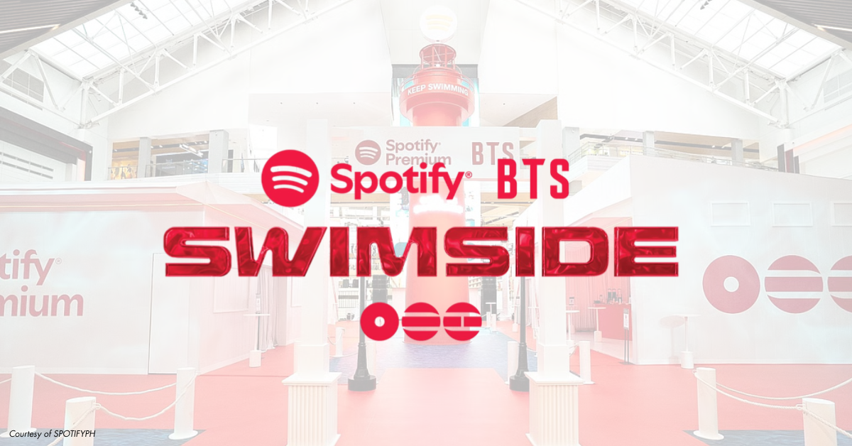
Spotify’s Disco Ball Debut: A Shimmering Spin on 20 Years of Soundtracks
What's new
.png)
Spotify’s Disco Ball Debut: A Shimmering Spin on 20 Years of Soundtracks
by Zooz Paraso
For two decades, Spotify has been a consistent, reliable beacon for our daily soundtracks. It acted as a silent curator for our lives, sitting in the same corner of our smartphone docks through breakups, road trips, and late-night study sessions.
Its logo is so embedded in our mind that changing it feels a bit like a break-up or a close friend showing up with a new haircut. For its 20th anniversary, Spotify did exactly that, swapping its flat minimalist green for a shining, shimmering, and I guess a splendid disco ball.
But, as someone who has tracked my life through "Wrapped" every year, it was a mix of nostalgia and a slight "What is this?" But as the initial shock wore off, the brilliance of the sparkle became clear.
The Retro Connection: Music as Time Travel
Many would wonder why the choice of a disco ball? While it’s sudden, it’s not surprising. Because Spotify carries the music and artists that span decades, leaning into this type of aesthetic means tapping into the Golden Age of the dance floor.
I believe that this visual shift perfectly mirrors their recent "Party of the Year" initiative. Personally, there is a profound emotional weight in seeing the song that first welcomed you to the platform and some of your listening habits. Thus, the disco ball serves as a sonic time machine, suggesting that while the technology is modern, the soul of the platform is rooted in the history of music. This actually transforms the app from a sterile utility into a celebratory space, reminding us that every stream is a tiny spark in a much larger, historical dance.
What Makes It Sparkle
But really, why risk changing a logo that is recognized globally? Maybe it’s because of emotional resonance and brand elasticity. In general, tech companies often feel cold and data-driven—no spark, just straightforward. By changing its appearance, Spotify signals that they are capable of joy and celebration. That they can prove that the brand has “the beat.”
Moreover, I think that while we live in an era of minimalist and stricter branding guidelines, introducing texture, light, and motion is not a bad thing to explore from time to time. Spotify uses this risk to stand out in a crowded app drawer and honestly, they did capture our attention. They also create a moment that would engage you to tap and listen. This activation generated organic conversation, forcing users to look at the app with fresh eyes rather than just tapping it out of habit.
Not Everyone’s Cup of Tea
However, the sparkle isn't without its critics. Some veteran users argue that Spotify’s brilliance has always been its invisibility—it’s the stage, not the performer. By making the logo loud, some feel the app is prioritizing marketing stunts over the sleek, focused UI they pay for. For some, it’s not just about the execution, but also the design. Some said that the disco ball felt like clutter.
In the past, Spotify’s initiatives were mostly contained within the app (like Wrapped). Bringing the party to the home screen icon can feel like an intrusion on the user’s personal device aesthetic. There’s a valid argument that when you’ve built a brand identity, messing with it can feel like a distraction from the core product.
The Art of Disruption
In my opinion, we’re now living in the modern marketing landscape. While I believe that sticking to your branding is non-negotiable, being disruptive is the only way to get far. Having fun is not being unrecognizable, but rather a way to show people the other side of you. I think it’s time that we recognize that branding is just the foundation, but disruption is the fuel. If you never shake the foundation, the world eventually forgets you’re standing there.
Personally, I only noticed the change lately. While its appearance changed, its function and music didn’t and I guess that’s what matters. For Spotify, they aren't abandoning their roots; they’re just dressing up for the celebration. This sparkle is a calculated risk that acknowledges a vital truth in the industry: Even the most iconic brands must evolve to stay relevant. You maintain the brand’s soul, but you disrupt the execution to remind the world that you are still the leader of the pack.
The disco ball logo is really a brave move. This stunt connects us from the past generations of artists while proving that Spotify is bold enough to mess with its own perfection today. After 20 years, the platform proved that it isn't just a library of files, but part of our everyday lives. A little sparkle never hurt anyone, especially when it's backed by two decades of being the world's heartbeat.


.png)
.png)
.png)
%20(1).jpg)


.png)


.jpg)


.png)
.png)
.png)

.png)


.png)

.jpg)
-min.png)


.jpg)
